
Add texture with a light touch.
Texture can give digital artwork warmth and character. The best finish supports the drawing rather than making it harder to see.
Written by Vivid Creator Studio · 7 minute read
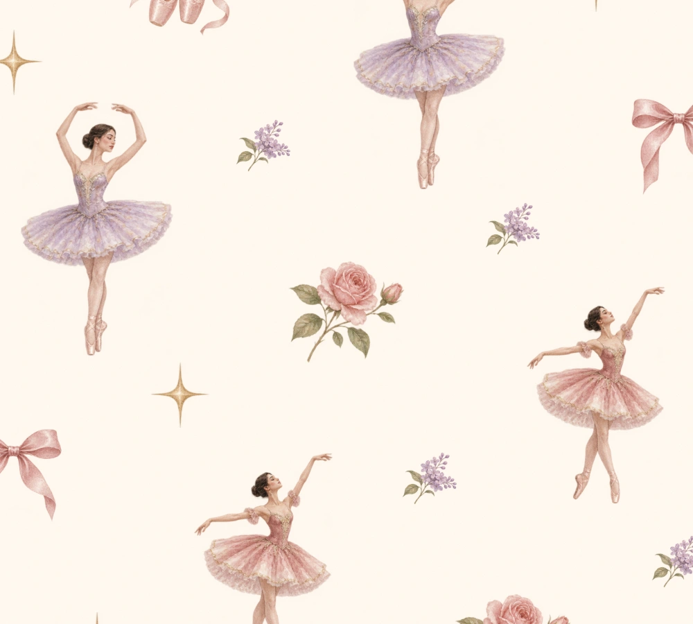
Choose a surface that suits the artwork
A delicate painted flower and a bold graphic shape may need different finishes. Fine paper can add a quiet surface; woven linen and artist canvas introduce a more regular structure. Speckle or screenprint dots can give a stronger graphic character. Choose the effect for the illustration you have, rather than because its preview is dramatic.
Start with a copy in Texture Studio. Keep the unchanged source available so you can compare. A surface effect is a creative treatment of the image; it should not cover an unresolved crop, poor resolution or messy edge.
Control how much texture you see
Strength changes the visibility of the finish. Start gently and compare a pale area, a dark area and a fine outline. A texture that looks attractive in a blank background can compete with the shading in a face or the folds of a painted dress.
Use the original comparison to check whether the finish adds something useful. If the texture is the first thing you notice when it should support the illustration, reduce its strength. A stronger effect may suit a graphic poster while a quieter one works better for small stationery.
Make the grain the right size
Texture scale changes whether the surface detail feels fine or coarse. Preview zoom is a separate control: it helps you inspect the existing pixels. Zooming the view does not change the grain in the downloaded artwork.
Look at the whole image and then at actual pixel size. Finally, judge the intended display or print size. Very fine grain may disappear when an illustration is reduced; very coarse grain may look like an unintended pattern on small products.
Treat stitched effects as an illustration choice
A stitched treatment can follow the drawing’s contours or run in a consistent direction. Compare curved forms, sharp corners and small internal spaces. Keep plain areas quiet when the motif needs to remain the focus. The aim is a convincing illustrated surface, with the underlying shape still clear.
Compare before you export
Inspect the most detailed part of the drawing, a nearly white area and a saturated area. Check whether any finish has made the subject look muddy or created unintended contrast. Shuffle the grain if a particular placement is distracting, then compare again.
Keep the right working files
Download the finished image as a separate version and keep your original artwork. Give the file a useful name describing the finish. If you want to build a drawing brush, a separate grain-source image is material for that workflow; keep it separate from the finished illustration.
Check the repeat again
A texture changes image pixels, including pixels near the edges of a pattern tile. Open the finished tile in Repeat Inspector and inspect several copies. A repeated grain edge can become visible even when the original illustration joined cleanly.
Also check whether the treatment suits the proposed product. A texture baked into a file and the real texture of a printed fabric or paper will be seen together. Use the finished result with intention rather than adding surface detail automatically.