
Find a colour direction you love.
Colour harmony gives you a way into a palette. Your creative decisions turn that starting point into a design with character.
Written by Vivid Creator Studio · 7 minute read
Keep the colour that inspired you.
Try another colour family.
A darker shade gives the palette range.
Start with something worth keeping
Choose one colour from your own illustration, a mood reference or a product idea. Decide what you want the finished range to feel like: delicate, cheerful, dramatic, earthy or graphic. That intention is more useful than moving a wheel at random until every swatch looks attractive.
In Colour Palette Studio, start from a colour, an image or a ready-made palette. Explore a harmony, edit individual swatches and lock the ones you want to keep. Treat the generated palette as material to work with rather than a rule you must follow.
Understand the main relationships
- Analogous
- Neighbouring colour families, such as rose, pink and violet. They can create a closely related, gentle direction. Add a light and a deeper shade so the artwork does not become indistinct.
- Complementary
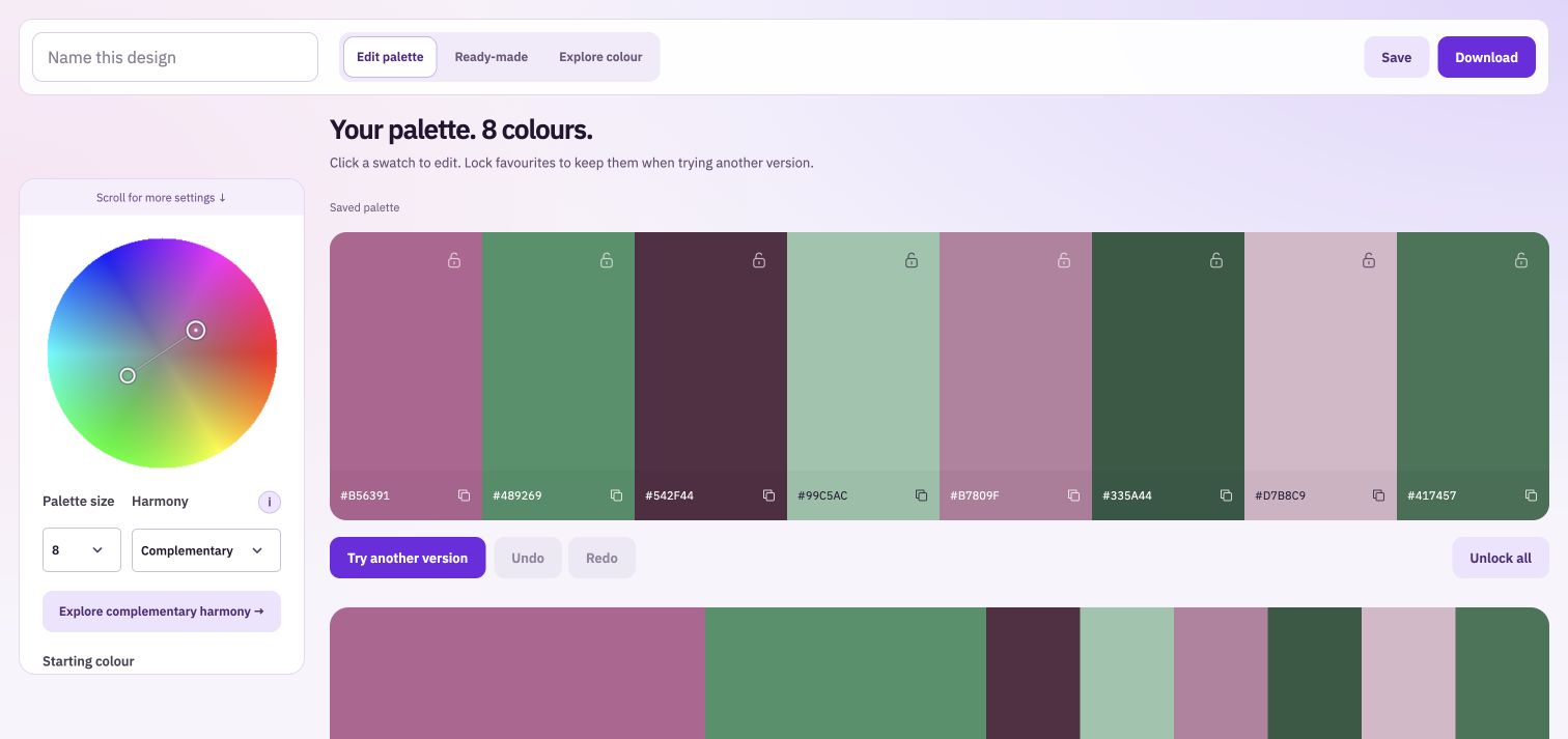
- Colour families from opposite sides of the wheel. Rose and green can give a floral print energy. Let one family lead and use the other deliberately if an equal mix feels too intense.
- Triadic
- Three families spaced around the wheel. They offer variety for a playful range. Changing their brightness and saturation can make the result softer or bolder.
- Monochromatic
- Variations within one colour family. Differences in light and dark carry much of the structure, so check whether small details remain clear.
Make the palette useful to draw with
A wheel describes hue: the colour family. It does not decide how pale, deep, muted or vivid each colour should be. Give yourself enough lightness range to separate foreground and background, and keep strong accents for areas that deserve attention.
For a ballet set, you might keep a warm cream background, use rose and mauve for the main illustrations, and add muted sage to the leaves. A deeper plum can help a label or small detail read clearly. The aim is a set of colours with different practical roles, rather than ten near-identical pinks.
Test the mood on actual artwork
Try the palette in Colourway Studio and compare it with the original. Look at delicate outlines, shadows, pale flowers and dark details. Closely related shades can behave differently from a flat block of colour, so inspect the full result before downloading.
Carry the colours into a collection
Save or download the palette for your drawing workflow, then make a supporting print in Simple Pattern Studio. Compare all the designs together. You can keep the same colours while changing how much of each appears in different prints.
If the range is for fabric, stationery, sublimation or print-on-demand products, check the actual printer’s specification and review colour on the intended output. A harmony can organise your colour choices; it does not guarantee a particular printed result.