
One design. More possibilities.
A colourway is a different colour version of the same design. It can open a new direction for work you have already made.
Written by Vivid Creator Studio · 6 minute read
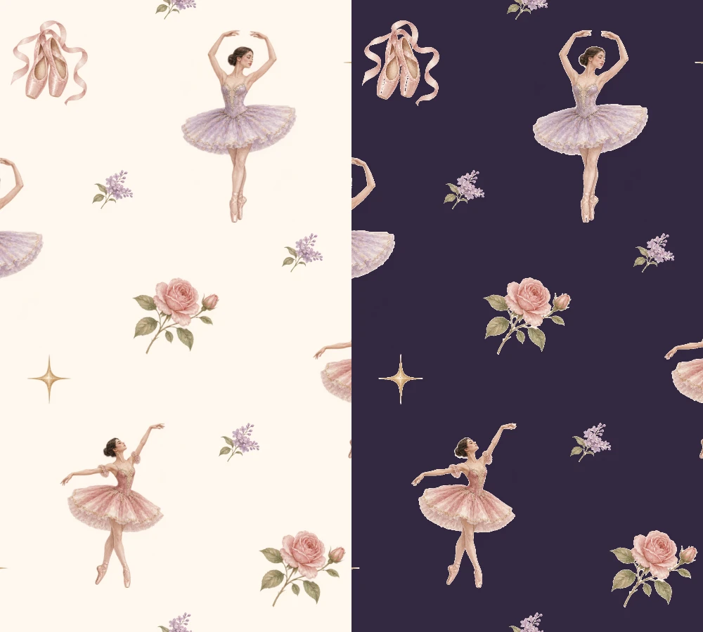
One composition. A different atmosphere.
Decide why you want another version
A new colourway should have a purpose. You might want a lighter option for nursery stationery, a deeper print for accessories, or a coordinating version for a fabric range. Keeping the composition consistent makes the colour decision easier to compare.
Changing the background alone can have a large effect. A pale background can reveal subtle outlines; a deep background can give light motifs more presence. Neither choice is automatically better. Compare it with the mood, scale and product you are designing for.
Replace colours with intention
Open a copy of your finished image in Colourway Studio. Choose the original colour you want to replace and a new colour, or try a saved palette. Begin with a large area such as the background so you can see the effect clearly.
Flat artwork is straightforward to judge because the colour regions are distinct. Watercolour, pencil texture and soft painted edges contain many related shades. A replacement may need a more precise selection or a gentler adjustment. Keep comparing the result with the original instead of assuming every nearby pixel should become the same flat colour.
Keep the details that make it yours
Look at the edges
Check pale fringes around flowers, coloured shadows and spaces between fine lines. They should belong to the new version rather than looking left over from the old one.
Look at the lightness
A new hue can be too close to the background even if the swatches look lovely together. Check whether the main shapes still read at a small preview size.
Keep your original image and download each finished colourway as a separate file with a useful name. “Ballet-rose-cream” and “Ballet-rose-plum” tell you more than a string of successive “final” files.
Turn another colourway into a useful range
Place the versions beside their supporting prints in Collection Builder. Consider whether each colourway needs its own stripe, wave or small-scale pattern. Use Mockup Studio to compare the visual effect at a realistic product scale.
If you recolour a seamless tile, check the downloaded version in Repeat Inspector. Colour replacement does not excuse a new gap or edge halo. Keep the checked repeat file separate from promotional mockups.