
Give every colour a role.
A palette is a set of possibilities. The way you use those colours decides whether the finished design feels gentle, bold, busy or calm.
Written by Vivid Creator Studio · 6 minute read
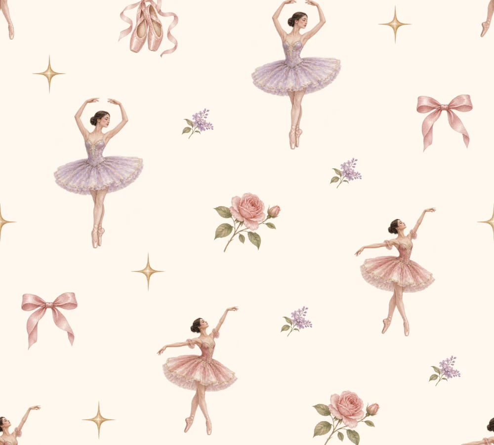 The main print
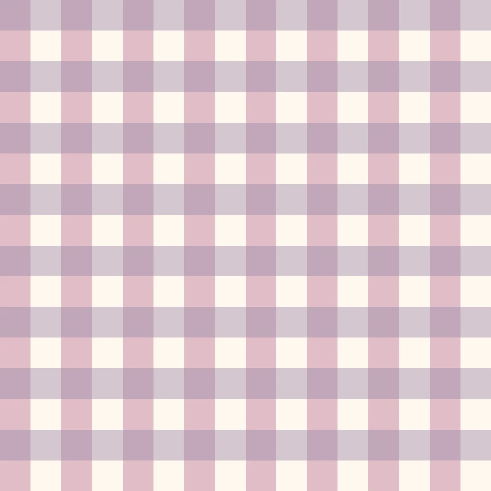 Supporting check
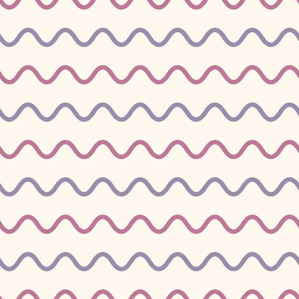 Supporting waves
Shared colours. Different levels of detail.
Choose what should lead
Begin with the part of the design you want people to notice. In a floral pattern that might be the flowers; in a stationery range it might be the headline or the illustrated character. Give that feature enough separation from its surroundings. You can create separation with a difference in lightness, saturation, hue, scale or empty space.
Choosing five attractive swatches is not the same as deciding how much of each to use. A pale cream across a background can occupy most of the image, while a tiny amount of deep plum carries the visual emphasis. Both colours have a job even though they cover very different areas.
Try the palette on the design
Use Colour Palette Studio to collect a light colour, a deeper colour and a few useful supporting shades. Lock the swatches that already work while exploring alternatives. Then use Colourway Studio to compare those choices in an actual illustration.
Check a small preview as well as a close view. If the flowers merge into the background, make one side lighter or darker. If every small detail competes for attention, reduce the number of strong accents. A restrained palette can still feel rich when it has a useful range of light and dark.
Build a range with variety
A coordinated range does not need every colour in every print. Let the hero design use the fullest palette. A supporting stripe might use cream and rose, while a small dot uses sage and cream. Sharing colours connects the range; changing scale, density and contrast gives each print a purpose.
Simple Pattern Studio helps you explore supporting prints beyond a single stripe or dot. Try a flowing wave, a geometric diamond or a glittering line, then compare it at the same size as the hero. Collection Builder is useful for seeing which design leads and which ones support it.
Use balance as a decision, not a formula
When the design feels flat
Look for colours with very similar lightness. Strengthen the main motif or quieten its background so the drawing has a clearer silhouette.
When the design feels noisy
Limit the strongest colour to a few deliberate areas. Add breathing room, reduce competing motifs or choose a quieter supporting print.
There is no compulsory percentage split for a good palette. Use the finished work to guide you. Before printing, follow the printer’s colour and file requirements; a pleasing screen preview cannot predict every ink and material combination.